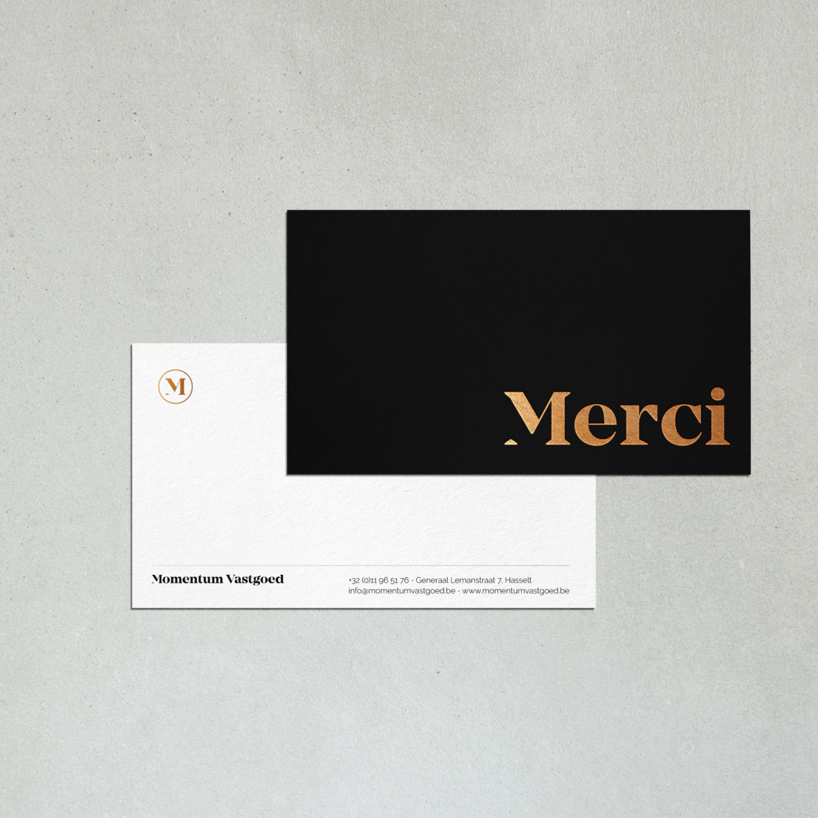
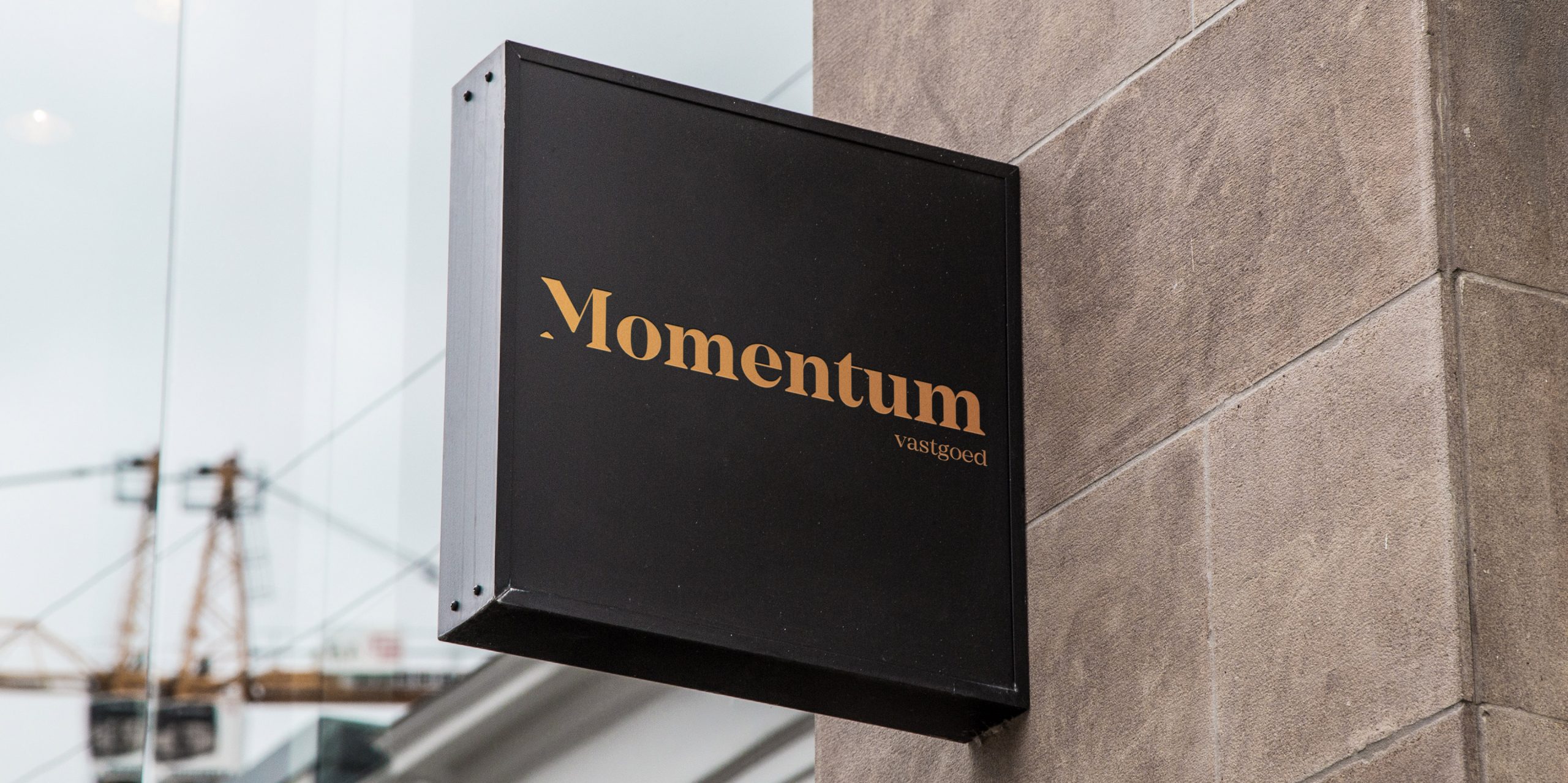
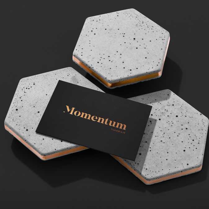
Stylish logo in black and warm gold for Momentum Vastgoed
• Studio Andrea Paolini designed a stylish logo in black and gold.
• With the triangle from the first letter I further expanded the visual identity.
• Momentum Vastgoed received a dynamic logo, in different variations.
The right property at the right time.
Vincent Van Assche and Kirsten Simonaitis of Momentum Vastgoed from Hasselt are passionate about real estate. They have a superb eye for properties, a solid legal background and they are born to sell. It’s their goal to seize the perfect momentum for their customers. Buying or selling real estate is about finding the perfect property at the perfect time. Their corporate identity needed to express this vision and that’s why they relied on Studio Andrea Paolini for their logo design.
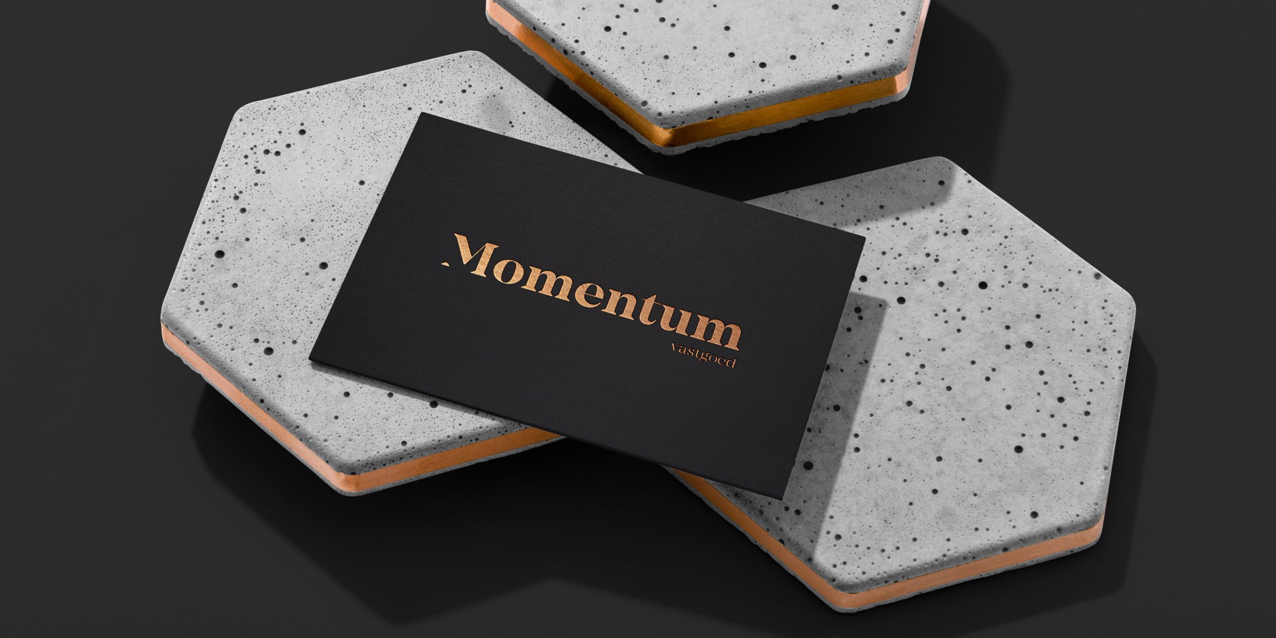
Homeliness and expertise in a logo
In order to discover the way the real estate agents wanted to market their business, I created a number of moodboards. Two elements kept popping up. First and foremost was their expertise and precision — Momentum works like a Swiss timepiece. Secondly was homeliness, as a reference to their field of work and the way they connect with their customers. These elements became the base of a timeless and classy logo design in black and warm gold.
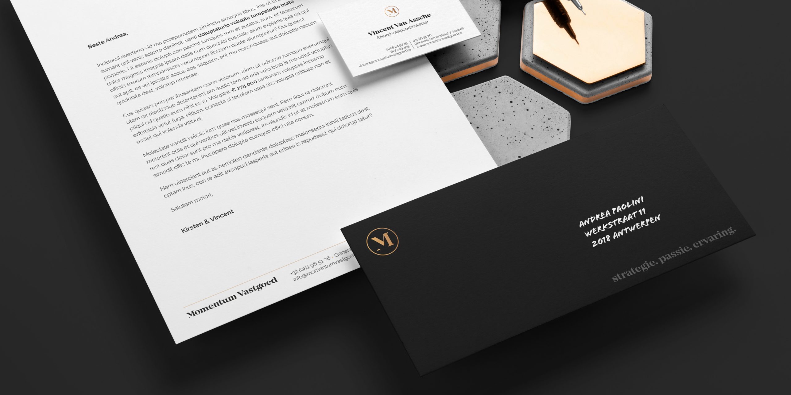
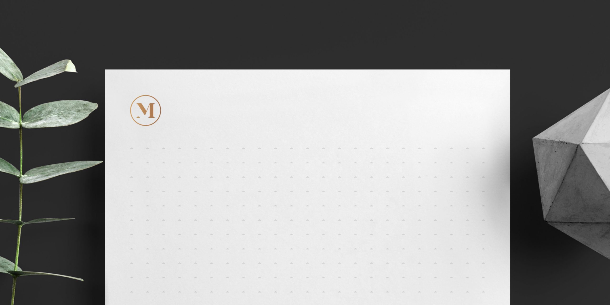
Triangle as a building block for the branding
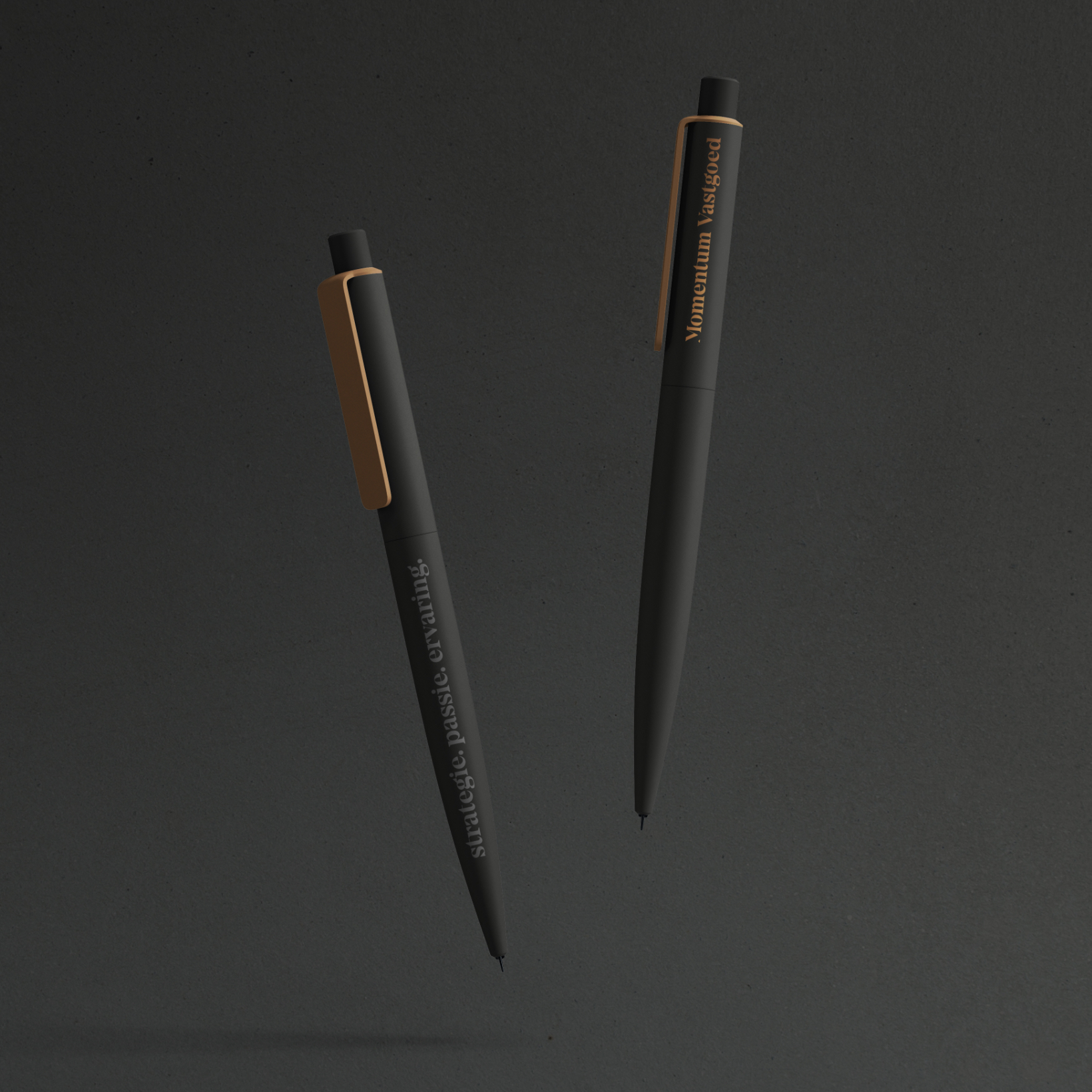
The logo comes in different sizes for different uses, from the golden letter M on gadgets to a big logo including their baseline on brochures and banners. The M contains a subtle triangle that Vincent and Kirsten can use in other marketing materials, for example as a watermark on notebooks. Their corporate identity with typical colors, logo and triangle is stylish, recognizable and relevant.
