Architectuurstudio Ina Jaspers

Readable and timeless logo for
architect Ina Jaspers from Genk

• A sleek and simple logo design for Architectuurstudio Ina Jaspers.
• The yellow accents represent the creativity of the studio’s exteriors and interiors.
• I created a dynamic logo, so that it remains legible in any context – big or small.

Architecture in a clear and readable corporate identity

Architect Ina Jaspers from Genk designs residential and commercial interiors and exteriors. She wanted a logo as clear and timeless as the houses she draws. So I made a lettermark from the initials of Architectuurstudio Ina Jaspers, with bold sans serif letters and repetitive strokes. The logo is used on huge banners and the studio’s stationery kit.

Yellow as accent color

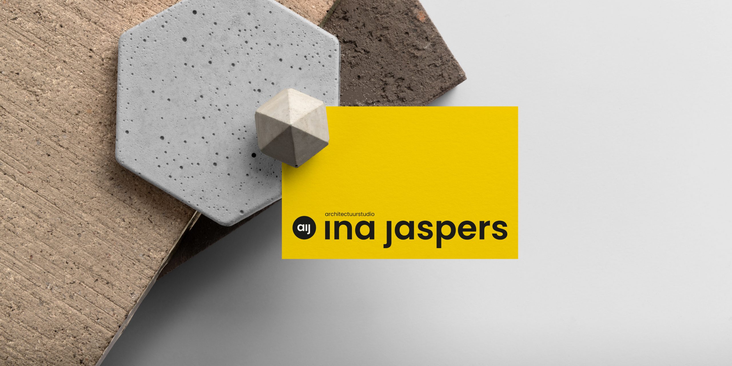
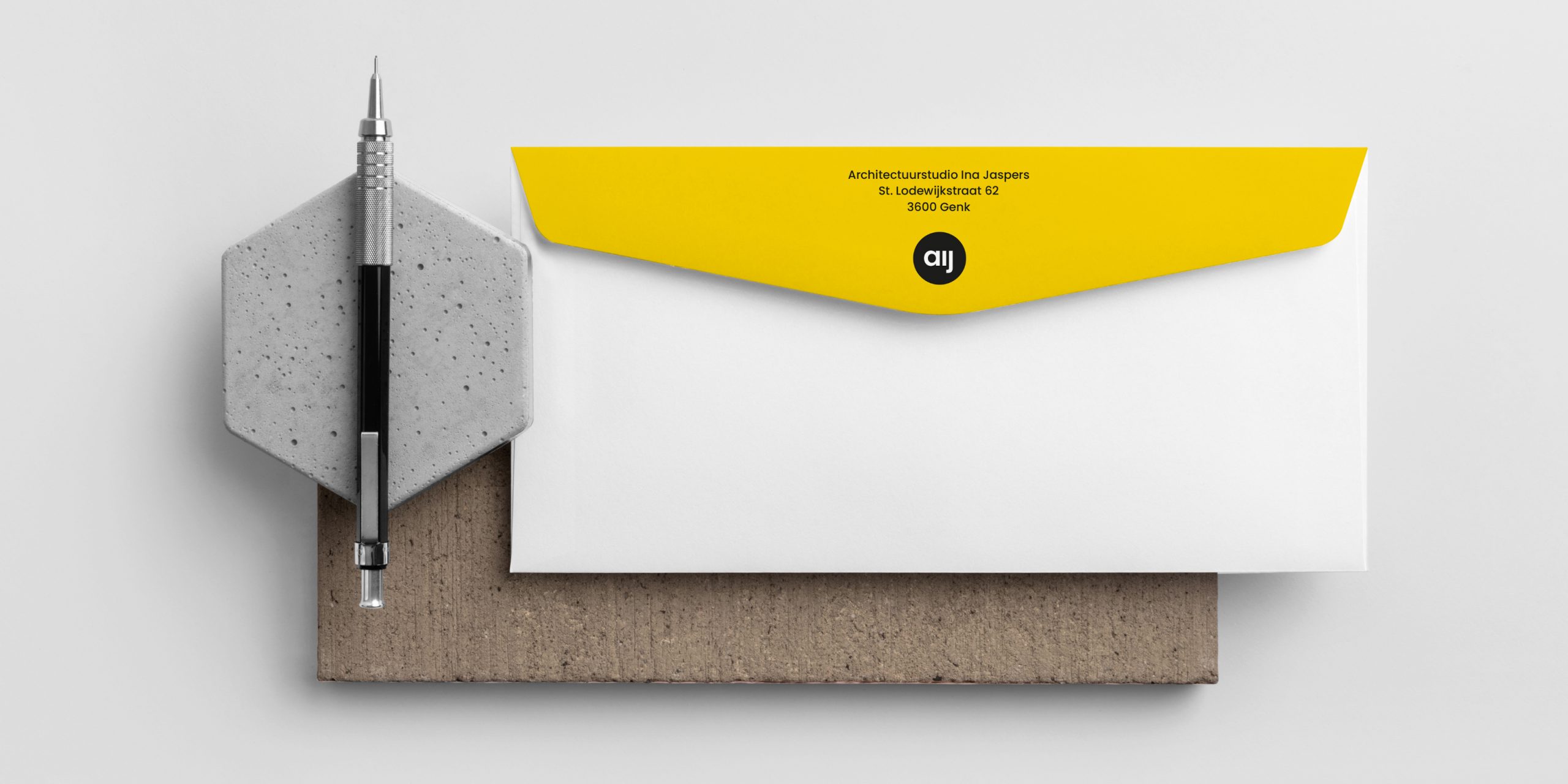
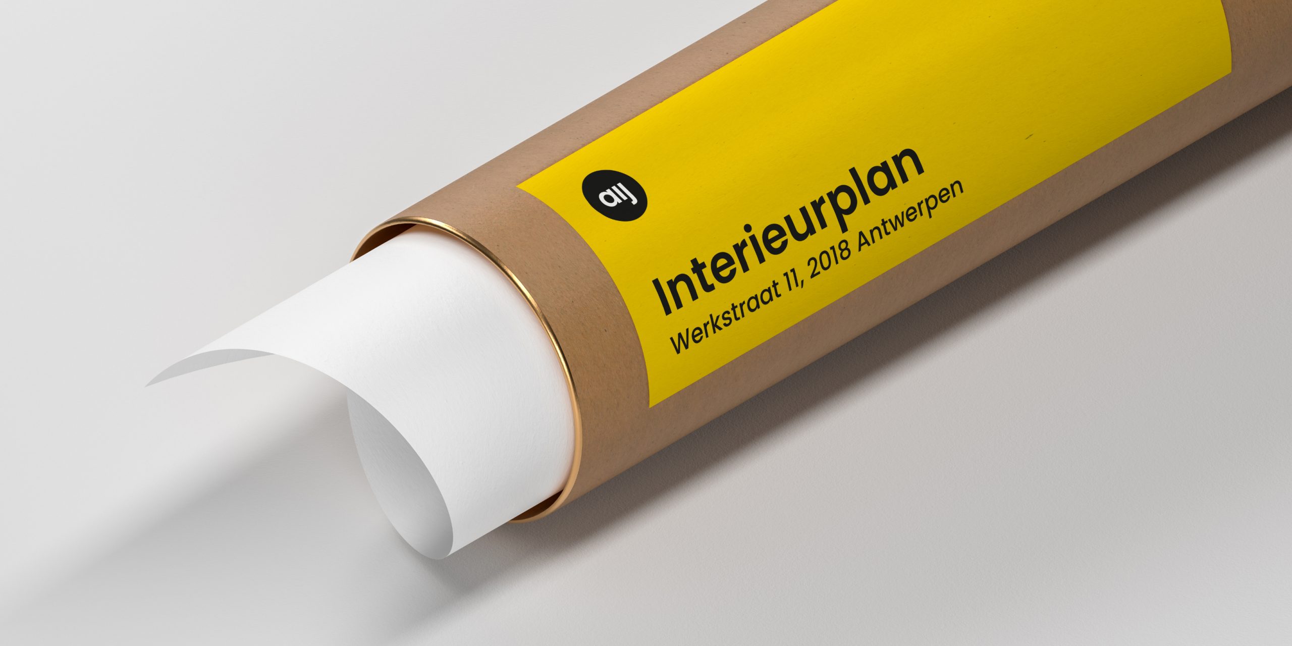
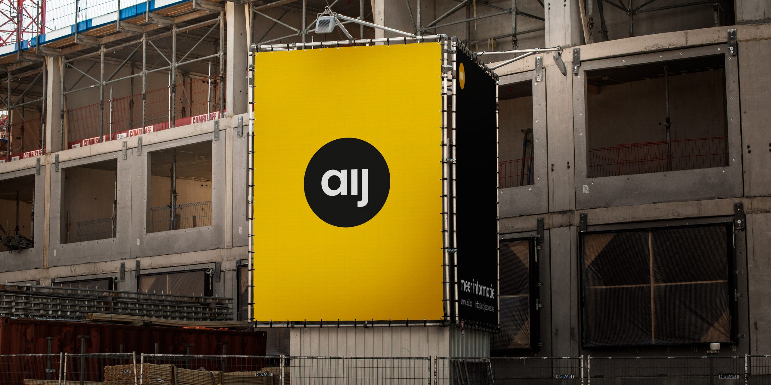
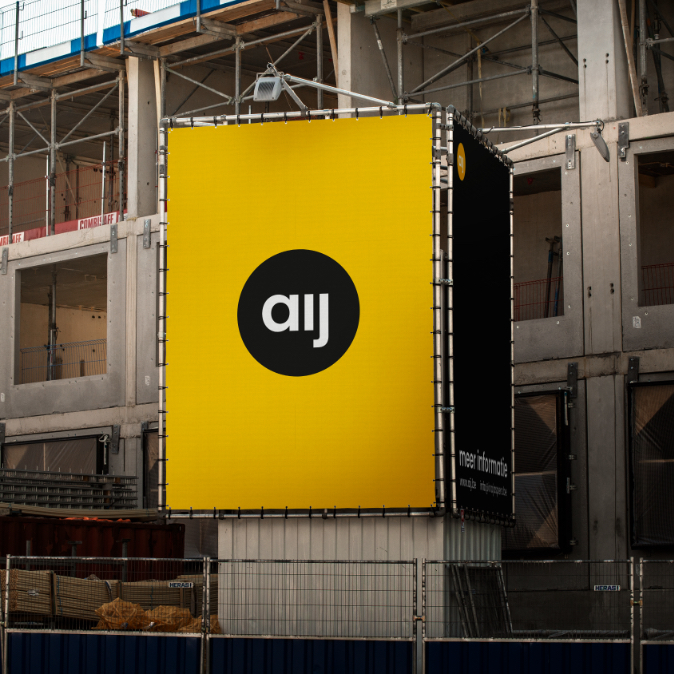
Yellow is the color of optimism, expression and energy, creativity and fantasy. The color also refers to interior accents. It emphasizes that extra creative touch. Ina chose a shade of yellow that stands out, but feels warm at the same time. The color contrasts nicely with the logo in black and white.

Not one, but three logos

As with most projects, I also made several logo variations for Ina Jaspers, to be used on small or big surfaces. That ensures their legibility in different contexts.

Do you adapt your logo according to the background or context?

Contact me to discuss your responsive logo design.