Roux

Modernity and style are key in the
corporate identity from this interior builder

• Corporate identity, logo, website and a lot of printed materials for Roux Meubelprojekten in Genk
• The new look-and-feel combines class, history and modernity
• The logo is designed responsively, in 3 versions, for different types of uses

Modern rebranding

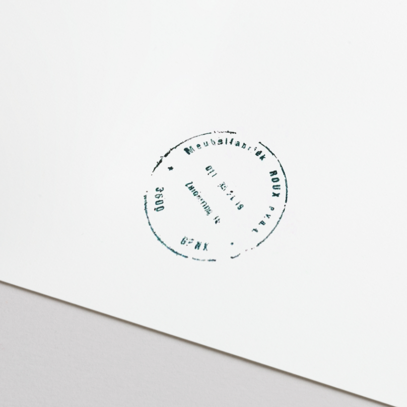
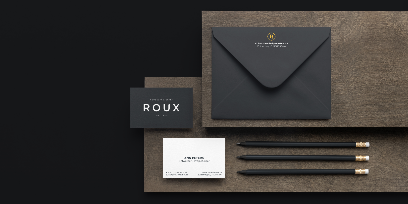
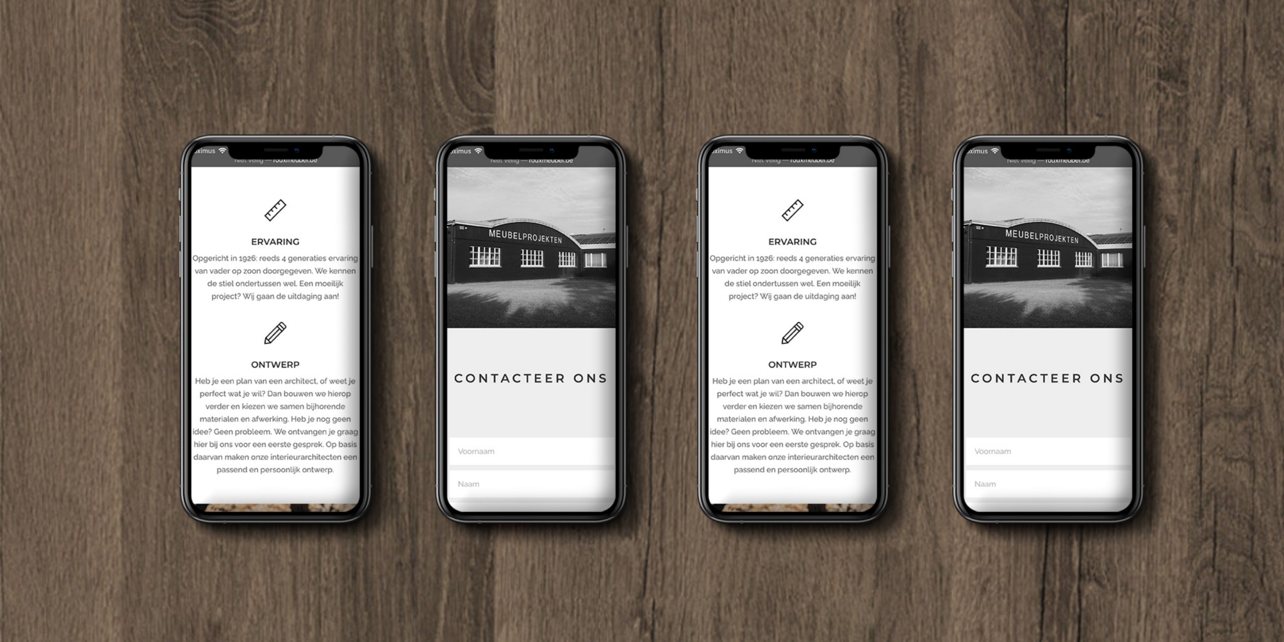
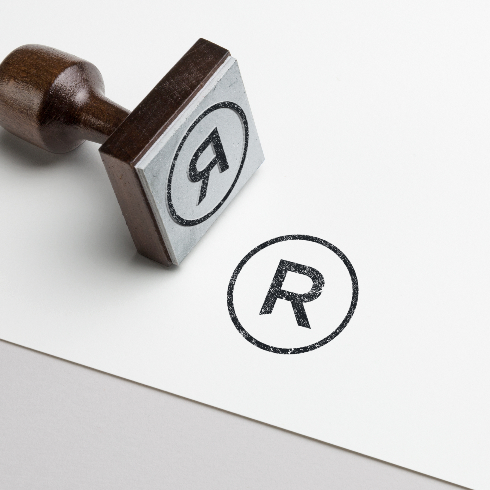
The Roux family has been designing, producing and installing furniture and interiors since 1926. With original designs, high-quality materials and a top-level finish, they leave their mark on kitchens, dressings and offices. Roux is a household name for architects and homeowners in the area. In order to appeal to a wider and new audience in the interior sector, the family business was in need of a refreshing, contemporary visual identity to represent them.

Logo as a signature of quality

An old Roux stamp was the inspiration for the new logo. The old stamp was a quality mark and a reference to how Mathys Roux once started his Mekanieke Schrijn- en Meubelmakerij in 1926. If you zoom in on the R and the U in the new logo, you will see that the edges have been cut diagonally — a subtle nod to carpentry. The Roux team received three versions of the logo, with an appropriate version for every type of carrier.

From logo to website

Roux chose to extend their new corporate identity into their complete stationery set. I designed business cards, notepads, folders and much more. I also built a website that displays the character of company: high-end, modern and with a long and interesting history. It also incorporates their three logos: from the symbolic warm yellow R to ‘Meubelprojekten Roux’ in full.

Are you looking for a way to attract a new and broader audience?

Market yourself with a refreshing and modern visual identity.