Antwerp Models

Branding as a statement of diversity for Antwerp Models

• An urban visual identity with thick, blocked letters letters
• Equality sign as a recurring symbol
• Terracotta accents that grab attention

The challenge

How do you capture diversity and street style in a visual brand design? That was the challenge for Antwerp Models, a modeling agency with a mission. Their logo became a statement in itself, with the equality sign as the core symbol.

A logo as a statement

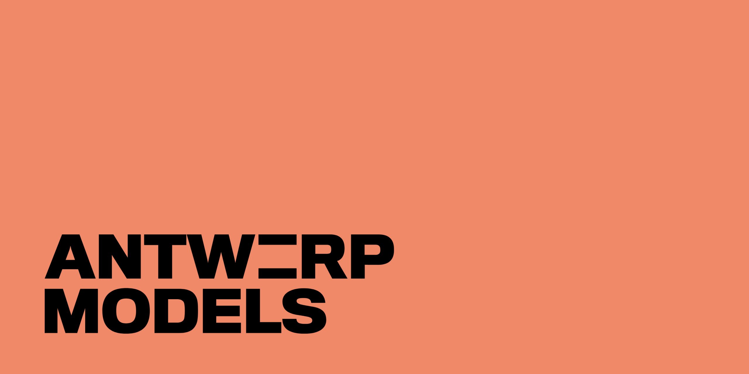
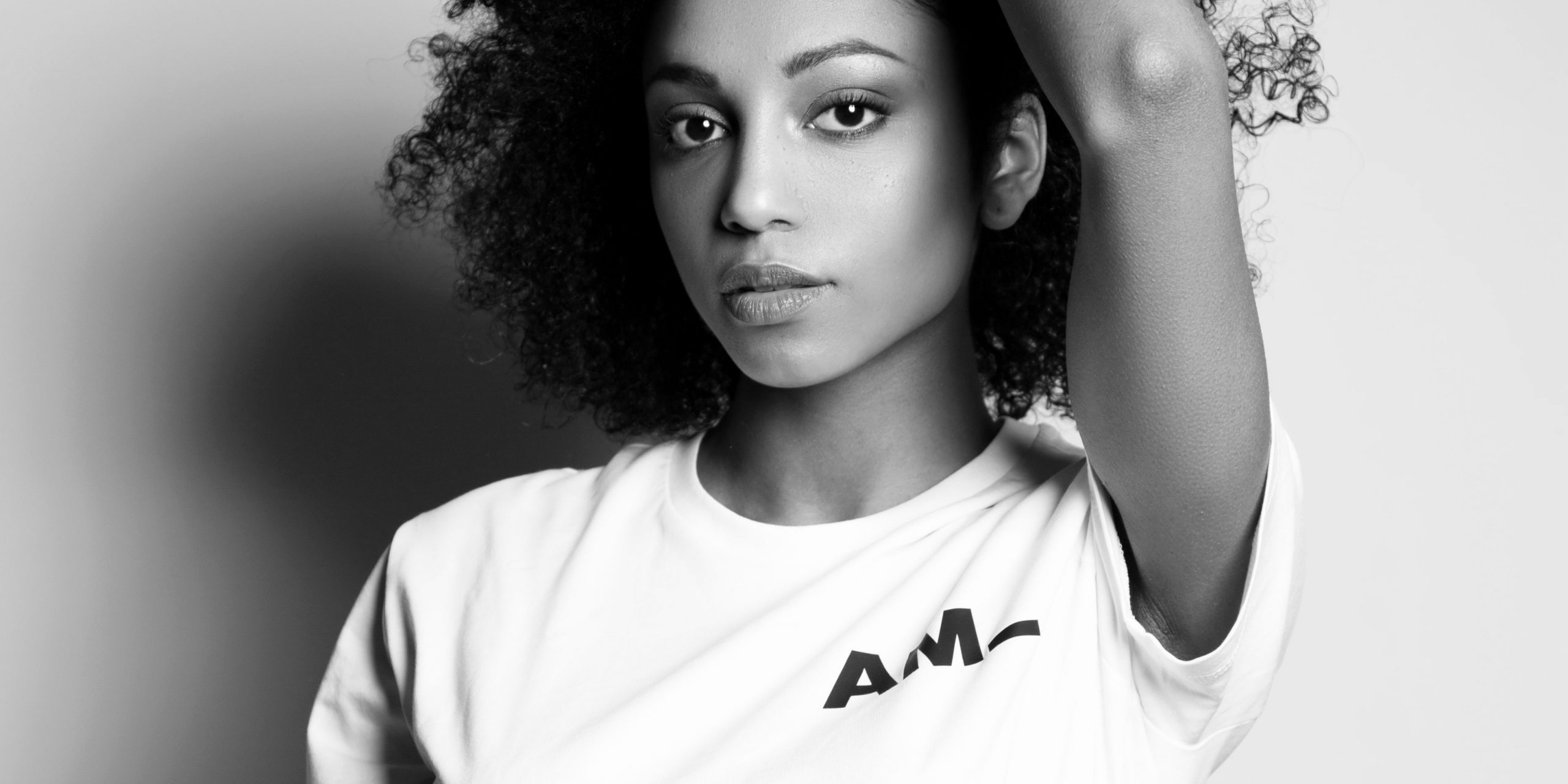
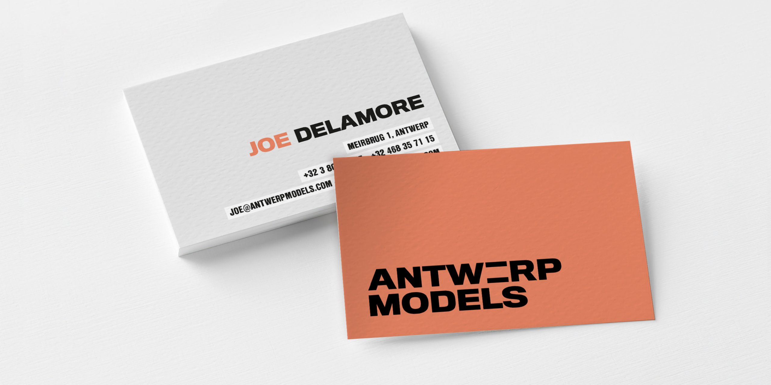
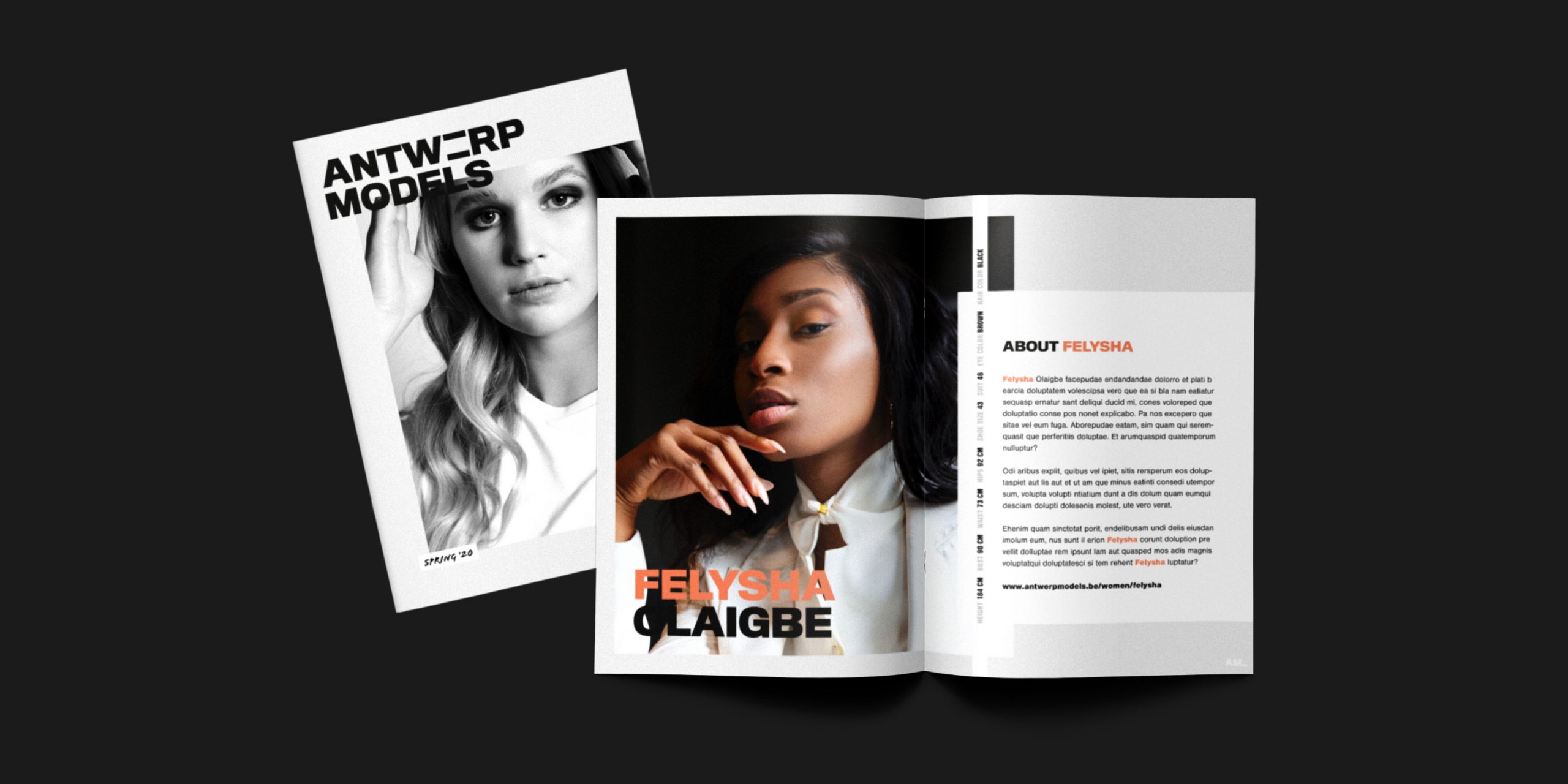
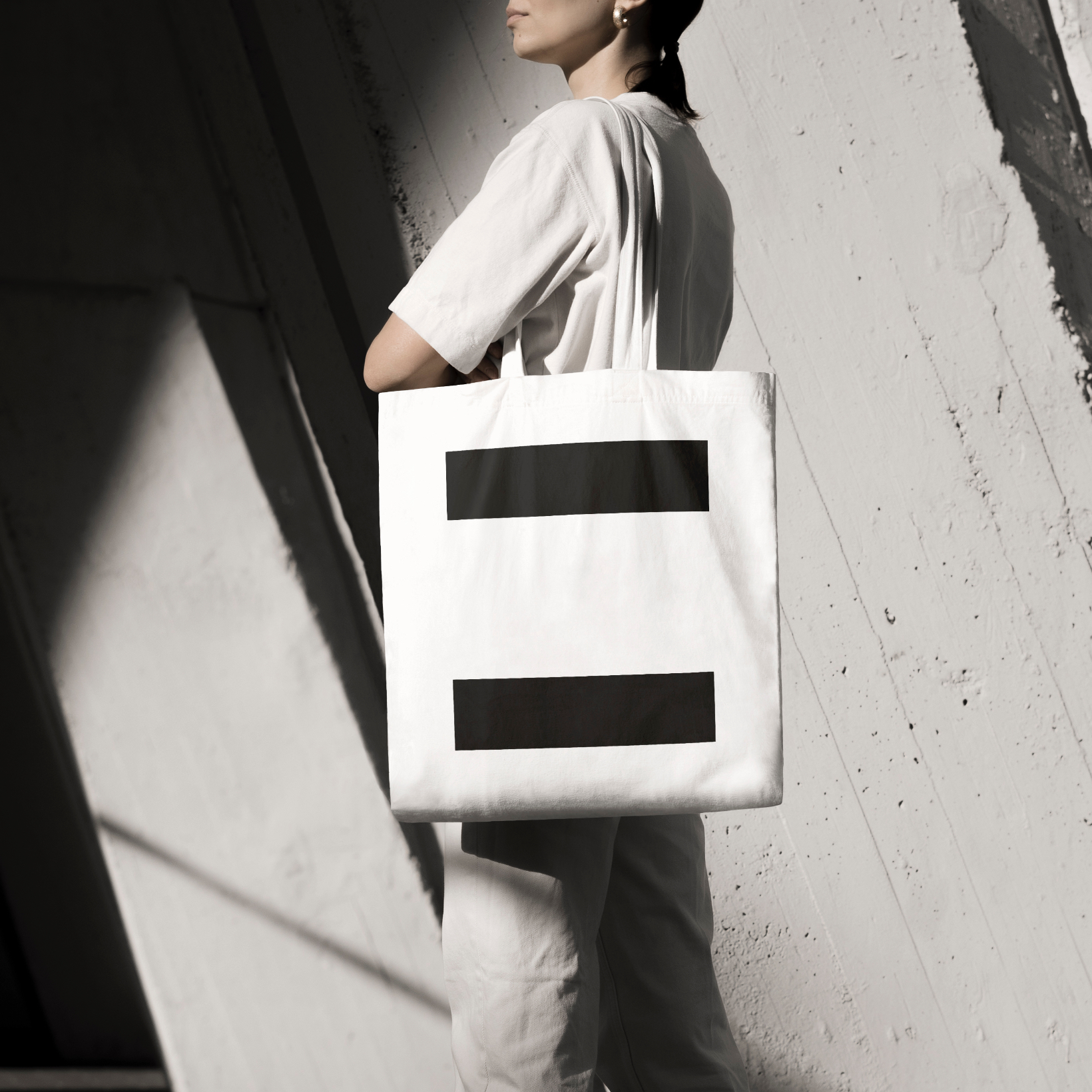
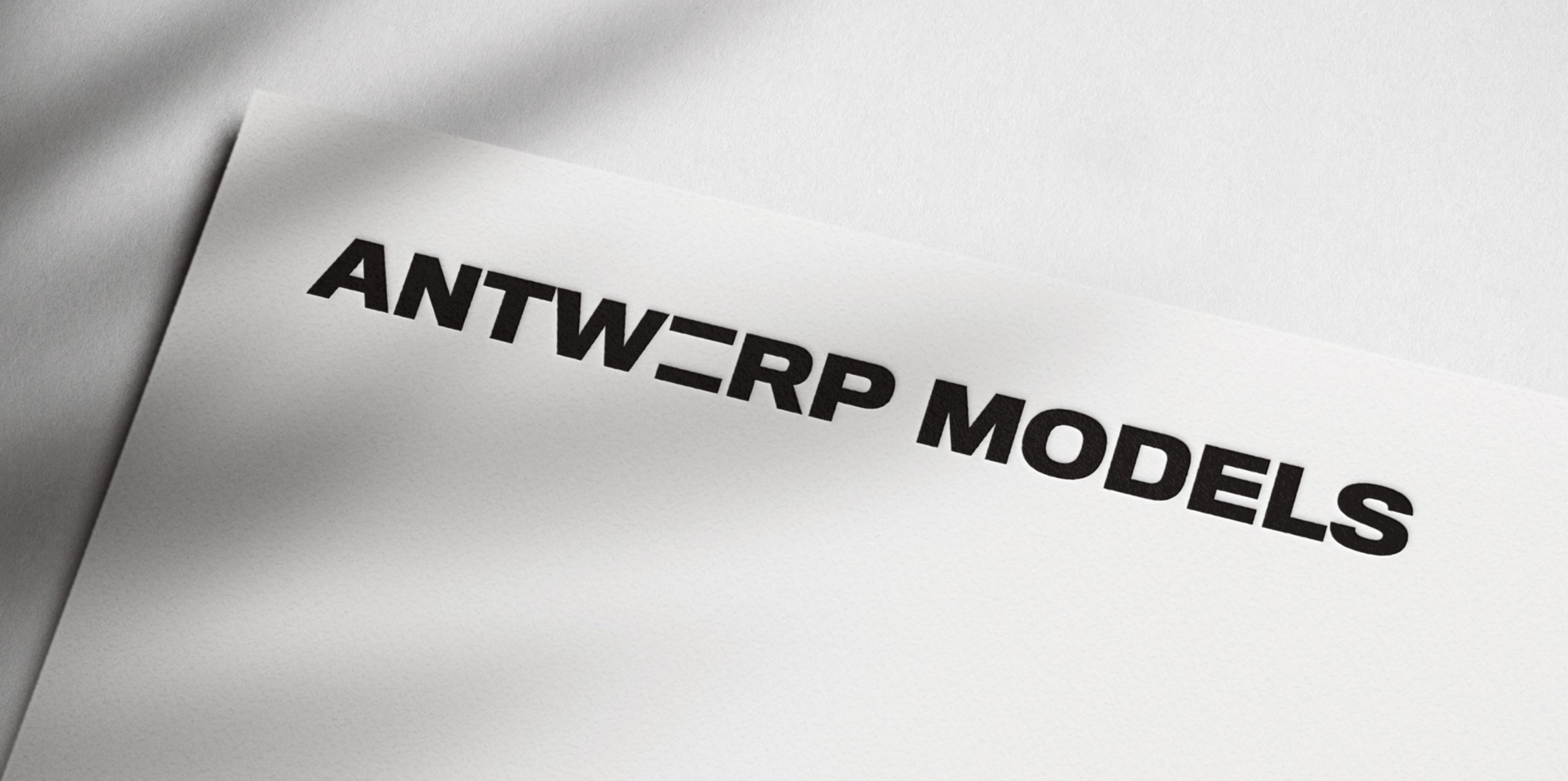
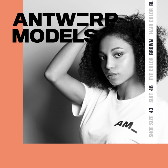
Anyone that sees Antwerp Models notices the equality sign – their plea for more diversity. And that starts with their own models. People of color, models with androgynous features or imperfections… All far from the stereotypes. Their corporate identity had to represent this. I started with a bold, blocked typography in black and white. What you see is what you get. Later I added the terracotta color to add a human touch.

Moodboard for your new corporate identity

Before I start designing your brand identity, we need to establish a clear vision of where you want to go. What’s your story? Which ideas do you want to convey? How should people remember you? That’s why I always work with moodboards, just like I did for Antwerp Models. Moodboards help streamline the design process.

Corporate identity, magazine and promotional material.

For Antwerp Models I designed a complete brand identity, a seasonal magazine and a bunch of promotional materials – such as tote bags with the equality sign. Studio Andrea Paolini created a straightforward brand design for Antwerp Models that screams “this is what we stand for”.

Are you a company looking for a kick-ass brand statement?

Contact me and tell me what you need.