Capital A

Corporate identity in modern blue for investment company Capital A

• Studio Andrea Paolini designed the corporate identity and website.
• The modern blue draws attention and inspires confidence.
• With their various graphic elements, Capital A can easily expand its corporate identity.

The challenge

Capital A is an investment company that attracts investors for real estate projects – residential as well as commercial – in Antwerp. I designed their corporate identity and designed the website. The designs radiate transparency, confidence and solidity.

Custom color: Capital Blue

Colors are decisive in branding. They evoke associations with your customers. That’s why I chose a modern shade of blue for Capital A, the color of confidence and wisdom. By using big blocks of color, the color stands out even more. In this way, the color  blue becomes a statement.

Business cards with the street map of Antwerp

The business cards were inspired by the city. Not a single business card of the Capital A team is the same. When the individual business cards are combined, the street plan becomes visible.

No hypes, but timeless designs

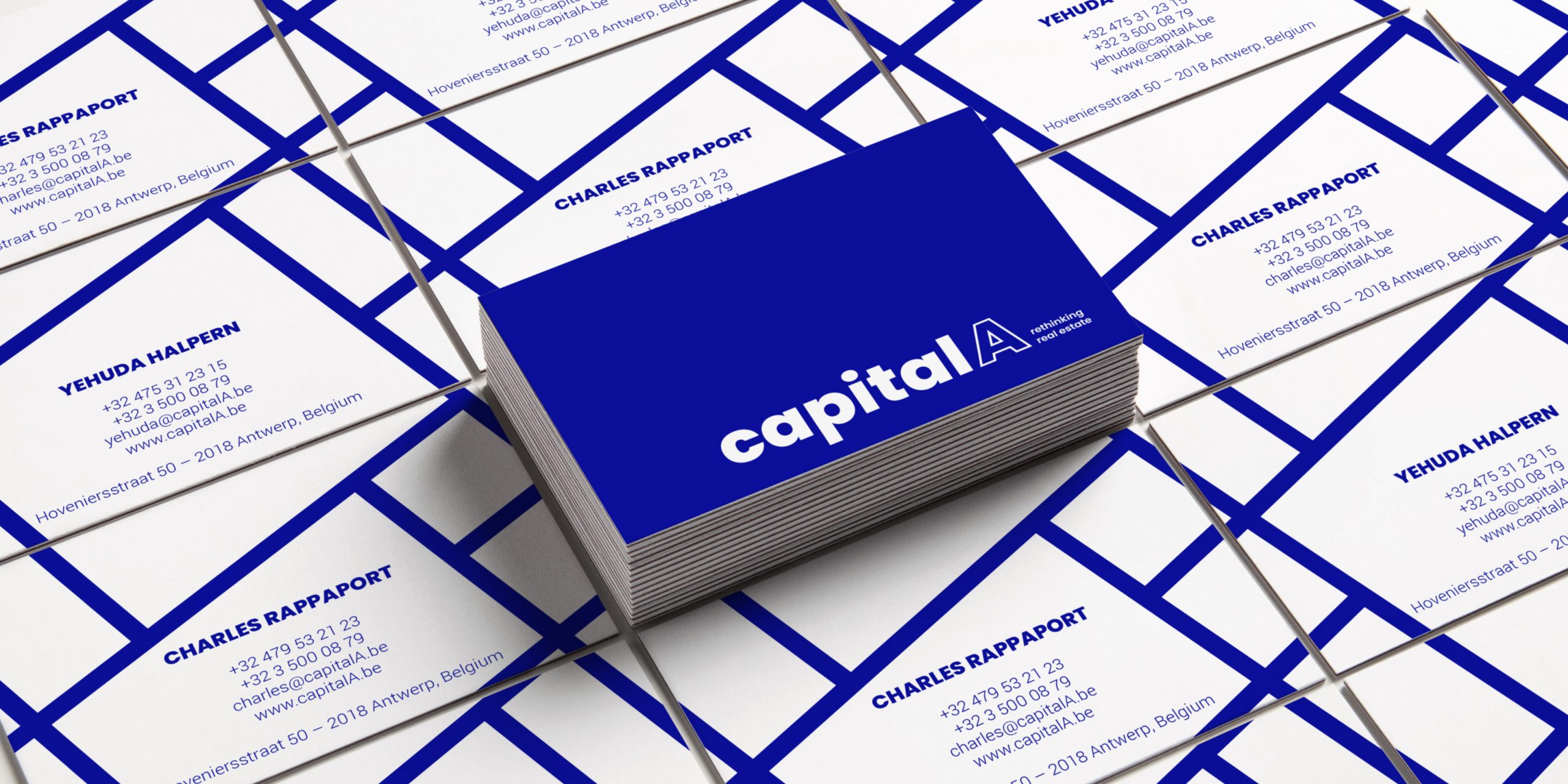
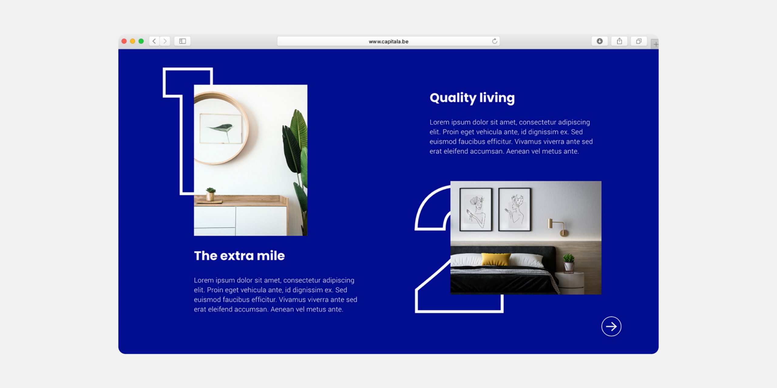
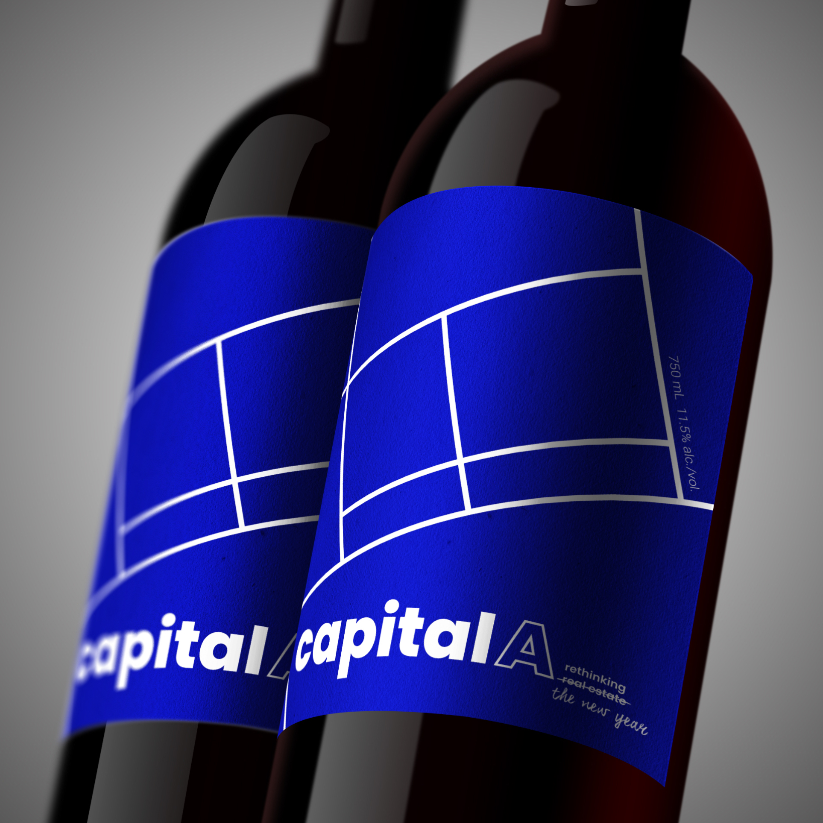
I made a simple, sleek and modern wordmark for Capital A. It’s easy to read. That’s also how I designed their website: with big color blocks, photos and numbers. What you see is what you get. No-nonsense, just like the company does business. The recognizable color,the typography, the lines, … These elements create a recognizable house style that can be easily expanded to customer gifts, stationery or even the office interior. That conformity also ensures trust among customers.

Curious how you can expand your corporate identity?

Request a meeting and quote.