Saray

New logo and corporate identity for kebab legend in Genk

• Responsive logo for different purposes — from packaging to window displays
• Modern nod to the classic image of the döner kebab
• Custom color palette and modular graphic elements

The story of a brand captured in an image

Anyone who lives in or around Genk has probably visited Saray for a good snack. At Saray you find the classic Turkish fast food, but super fresh, full of flavor and a little bit more refined. I captured all of these elements in their new logo. You will find both a reference to the name Saray and a reference to the classic image among kebab shops: the man with the meat skewer. 

Modular logo design

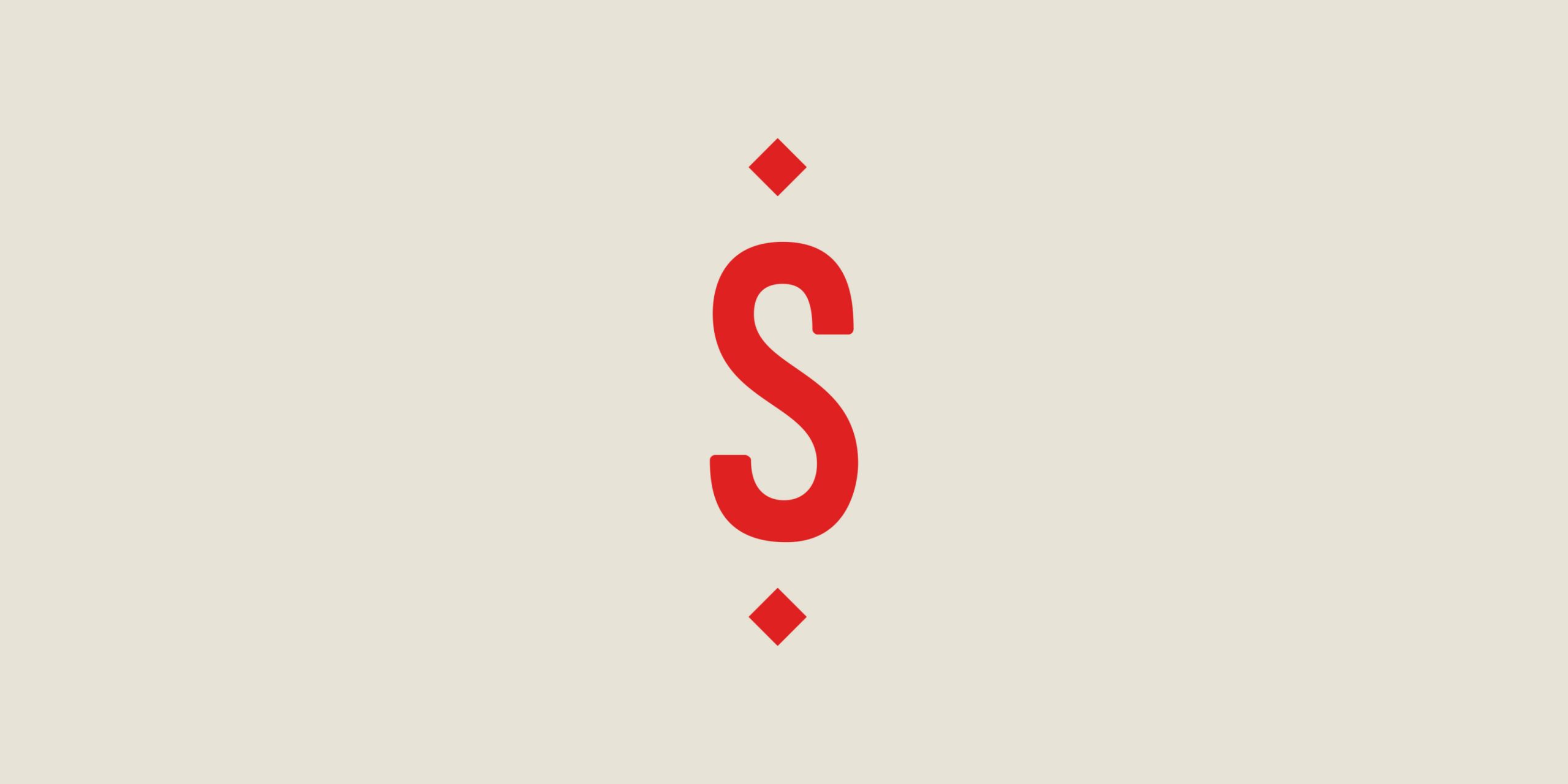
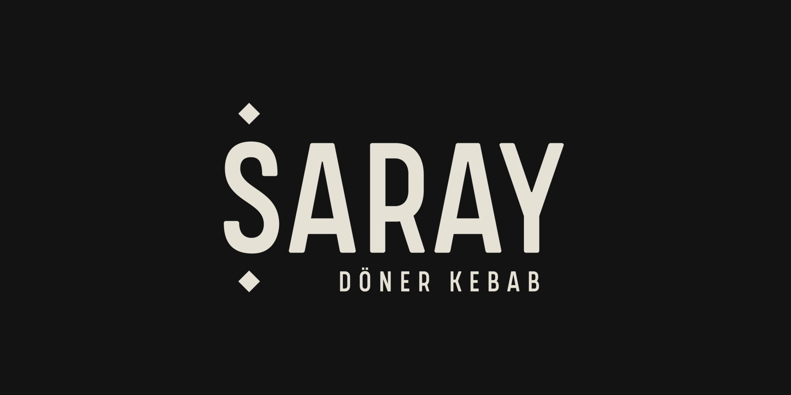
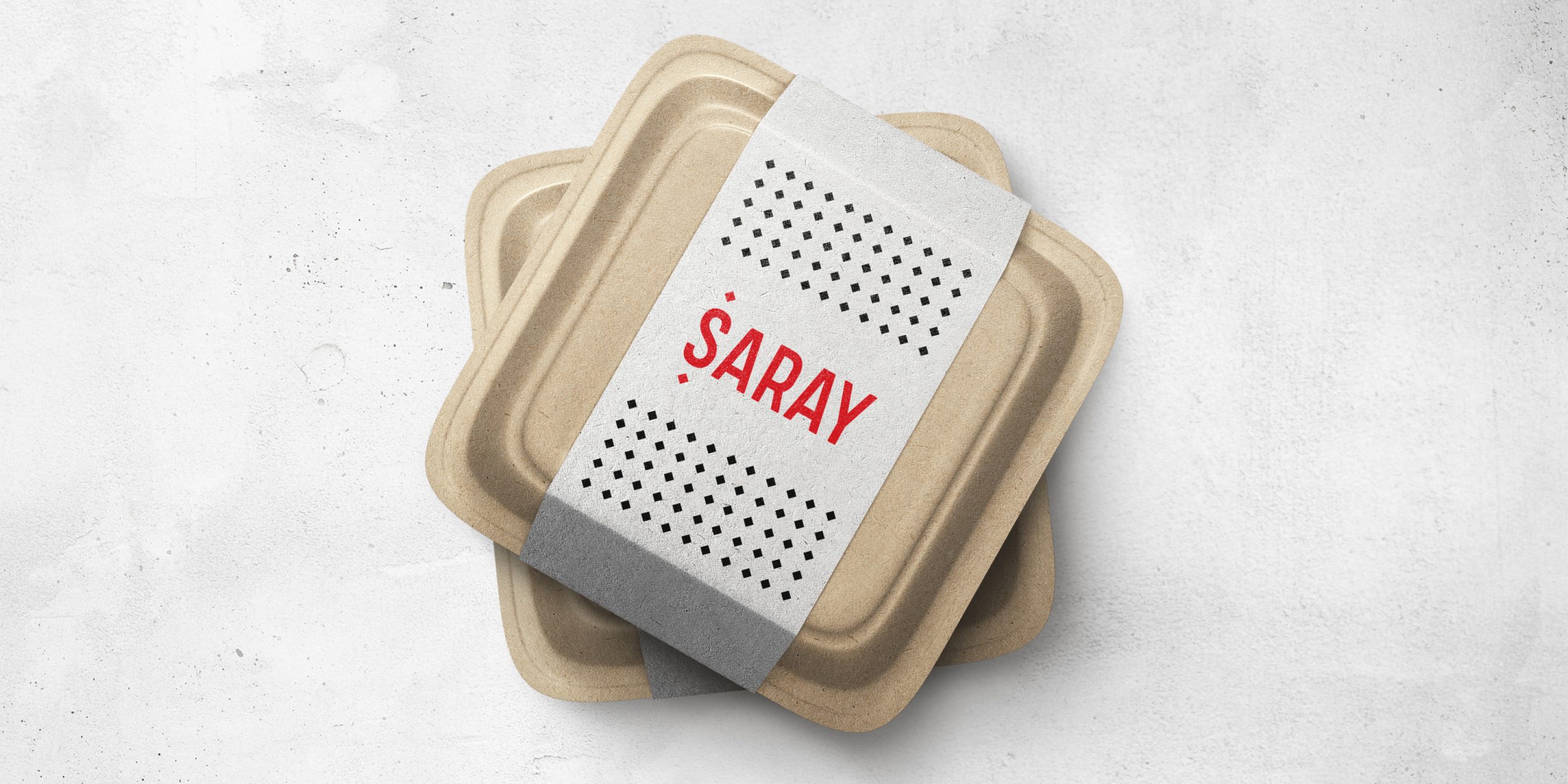
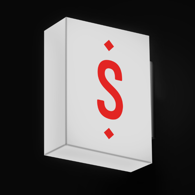
I didn’t design just one, but three logo variations to use in different context. The logo can also be perfectly incorporated into an animation. In addition to that, the tiny squares in the logo can be used to return more subtly on menu cards, order books and packaging.

Corporate identity in recognizable colors

In Saray’s color palette I added bread beige, authentic black and Turkish red. Colors that catch the eye and work up an appetite. They also lend themselves to be played with in the interior and all other means of communication. These three colors tell us: this is Saray.

The result

Studio Andrea Paolini made a multi-purpose and timeless logo for Saray in Genk, full of references to the kebab restaurant and a color palette and graphic elements to utilize across the entire corporate identity.

Is your restaurant also ready for a rebranding?

Contact us and request your quote.